Tips for Choosing an Edge to Edge Design
for an Art East Quilt

Where to Begin?
Each time I consider how I am going to quilt any top, I have a mental checklist that I go through. Let me walk you through how the list of shape, theme, flow, and colours informs my quilting on the distinct Art East Quilt Co style designs. Please, please keep in mind that quilting is art, and full of personal preference (thank goodness!) and these suggestions are just that, my personal preference.

Shape
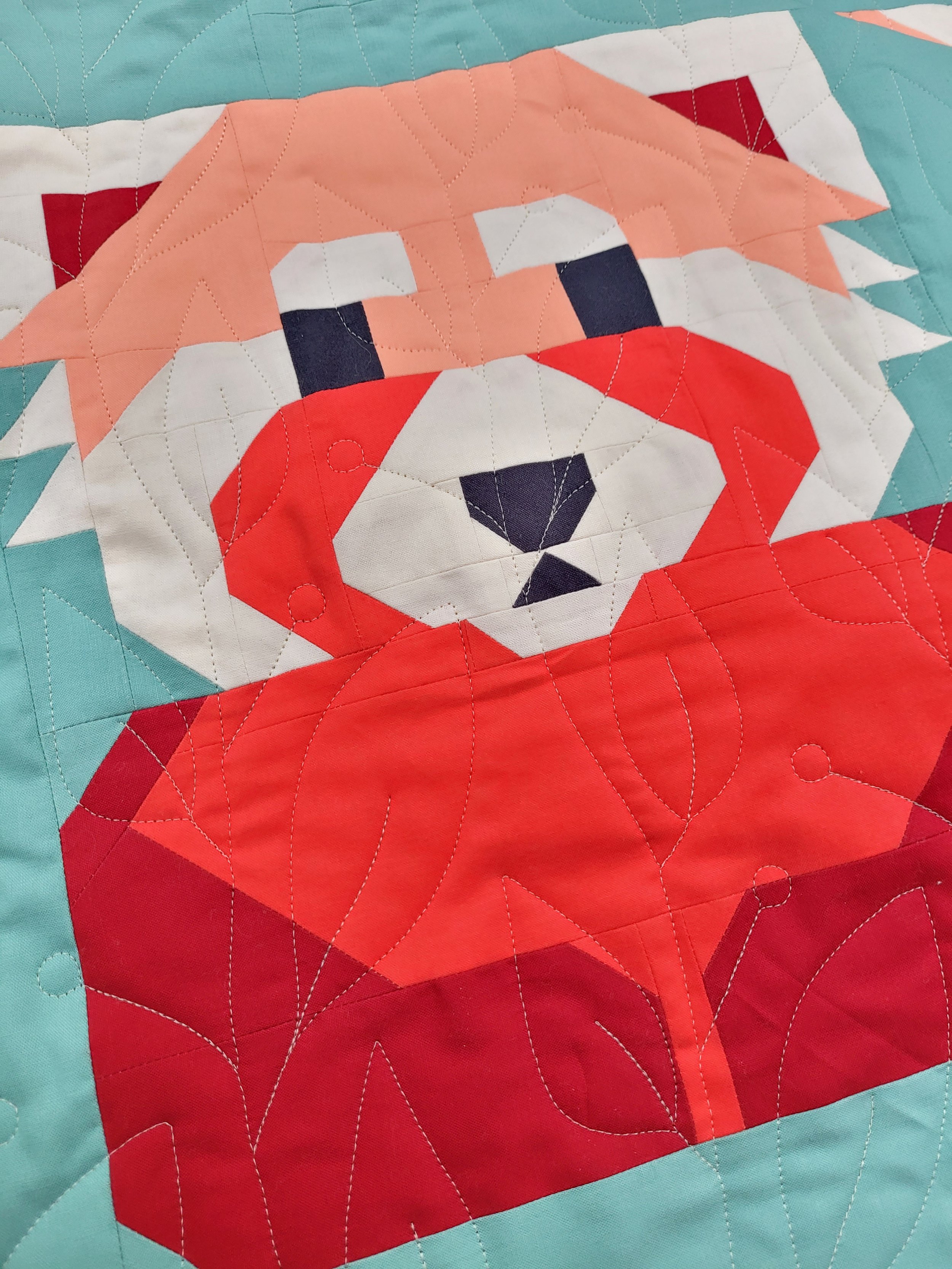
John MacPhail (the creative mastermind behind such quilts as Mythical Weiners, and Space Bacon) creates patterns that ALMOST all of the time contain only right and 45 degree angles. For me personally, this helps narrow down the choices by eliminating geometric designs that are based on any different angles. If you look at a quilt, and something seems a bit off, maybe like the quilting looks like it is fighting the piecing, look closer. Is there a design full of 60 degree Wishbones flowing over 45 degree Sloth Claws, or Fox Ears?
That is how John and I came to choose the flowy, and still angular Together pantograph, by Jess Zeigler of the Longarm League for his # Trending Quilt.
More About Shape
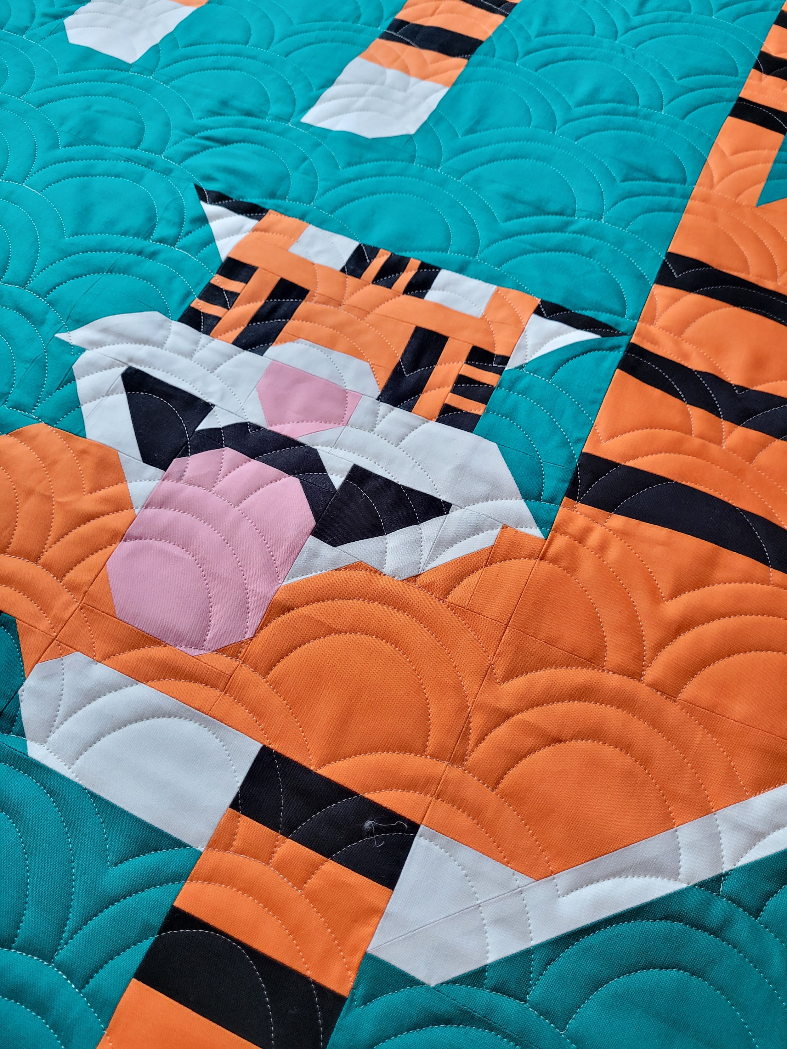
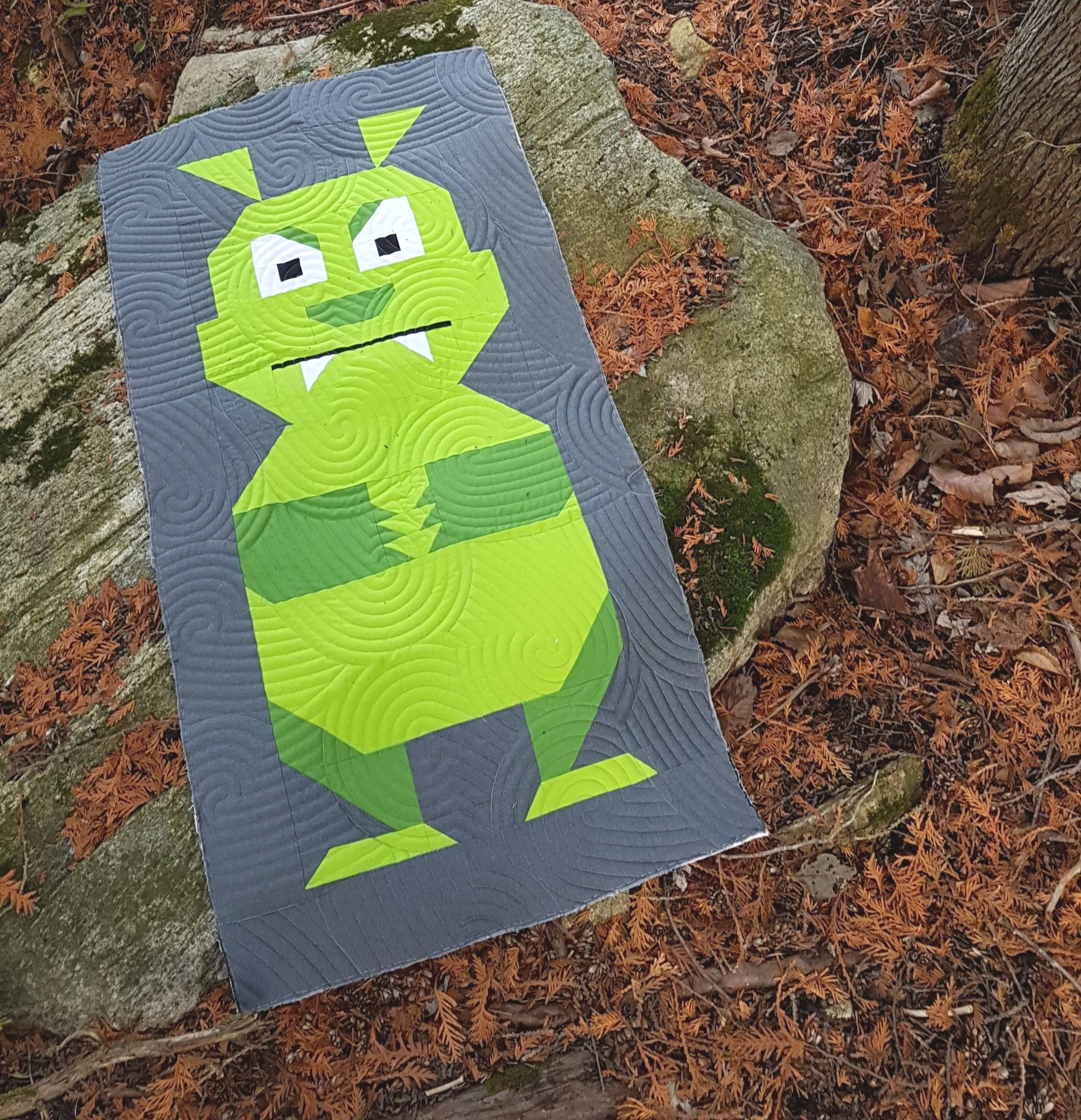
What John’s consistent choice of angles does NOT eliminate for me, are curvy designs. A swirly design with consistent texture like Thumbprints Jr. by Mike Fountain, on Intelligent Quilting suits all Art East Patterns, in my humble opinion, like my #Trending Quilt, in the picture above, or this Monster Mash fella. You can’t go wrong with circles, swirls, paisleys or waves.
I lean towards choosing curved designs over geometric and angular styles if I am not really sure of my piecing accuracy. Quilting straight lines with computer precision over a seam that is leaning, or going a little downhill acts like a neon sign pointing out “creative piecing.” Again, this is only my opinion, and thought-process, and probably points out the quirkiness that comes from staring at quilting designs every single day!
Note: If you are not a fan of dense or small scale quilting, or if you are obsessed with it and want it even smaller, all of these designs can be resized by a longarmer running a computerized system.

Theme
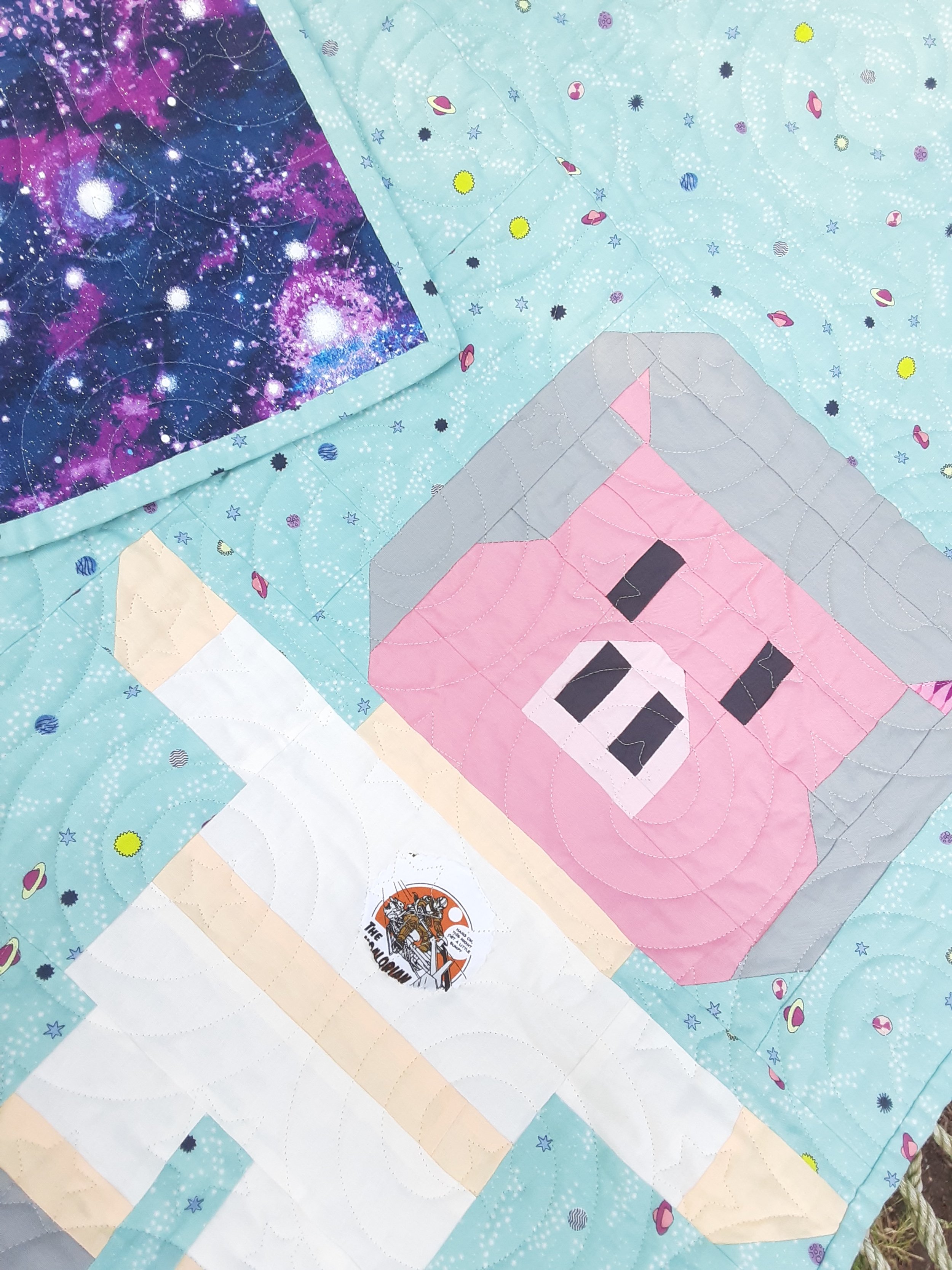
There is nothing more fun for me than picking a quilting design with a theme in mind! For me that doesn’t mean putting pictures of mammoths on a mammoth, pictures of carrots on a bunny, or space ships on pig astronauts (that kind of illustrative allover quilting feel like it is fighting with the piecing for attention, rather than supporting it) but something with a subtle nod towards the subject matter is a fun option. This Chilly Mammoth wearing a scarf would have suited snowflake designs, but isn’t this Chunky Knit pantograph by Tawny Oland of Simply Fabulous Quilting a fun choice? I also quilted a Chilly Mammoth, the sans scarf version, with Fractures by Karlee Porter. It looked like he was frozen in a block of ice!
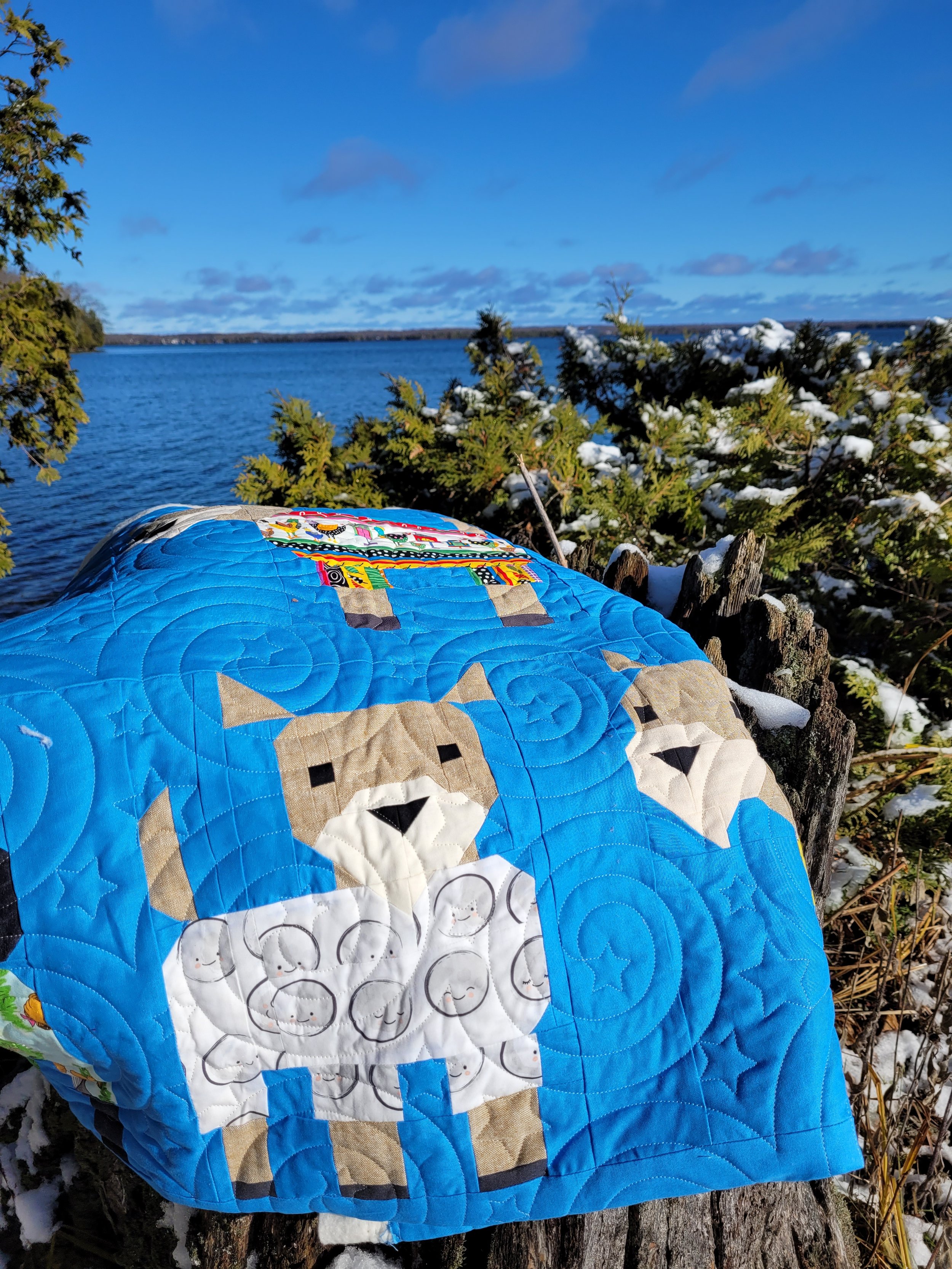
Blowing up Bunnies makes me giggle when quilted with the meandering Splat design by Apricot Moon. Kidding Around, Goats in Pyjamas and Space Bacon do well with the swirly starry Nightlight pantograph by Patricia E. Ritter, both designs can be found on Urban Elementz.

Exceptions to the rule…
It doesn’t take much arm twisting for me to use a really illustrative floral design on a quilt like Love Stinks, with large swaths of background fabric. The swirls around the fabric make me think of stink lines, which amuses me. Do what makes you smile, right? This pattern is Spring Flowers 2014 from Wasatch Quilting. Sometimes a happy coincidence will happen, like the placement of the spirograph type flower on this little fella’s eye. He looks like a Robo Cyborg Skunk in love now!
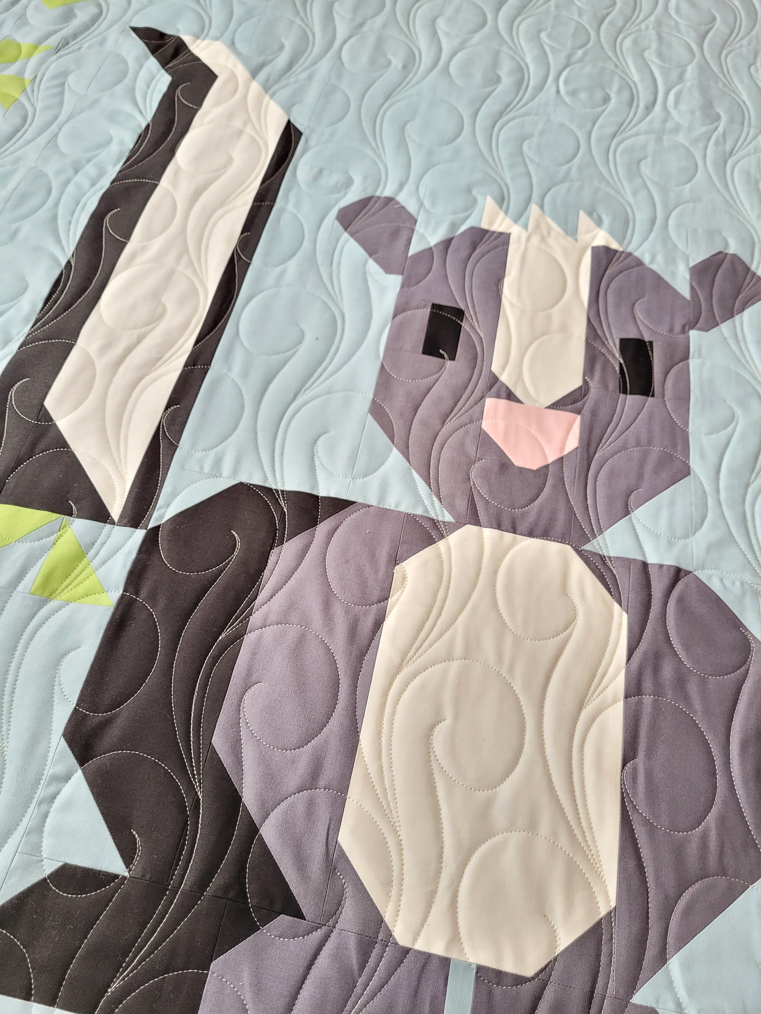
How about fellow Canadian Heather, of Red Willow Quilting’s, Branching design on the Red Pandas, matching the shapes and theme of these little cuties deep in their favourite place, the trees?
Flow
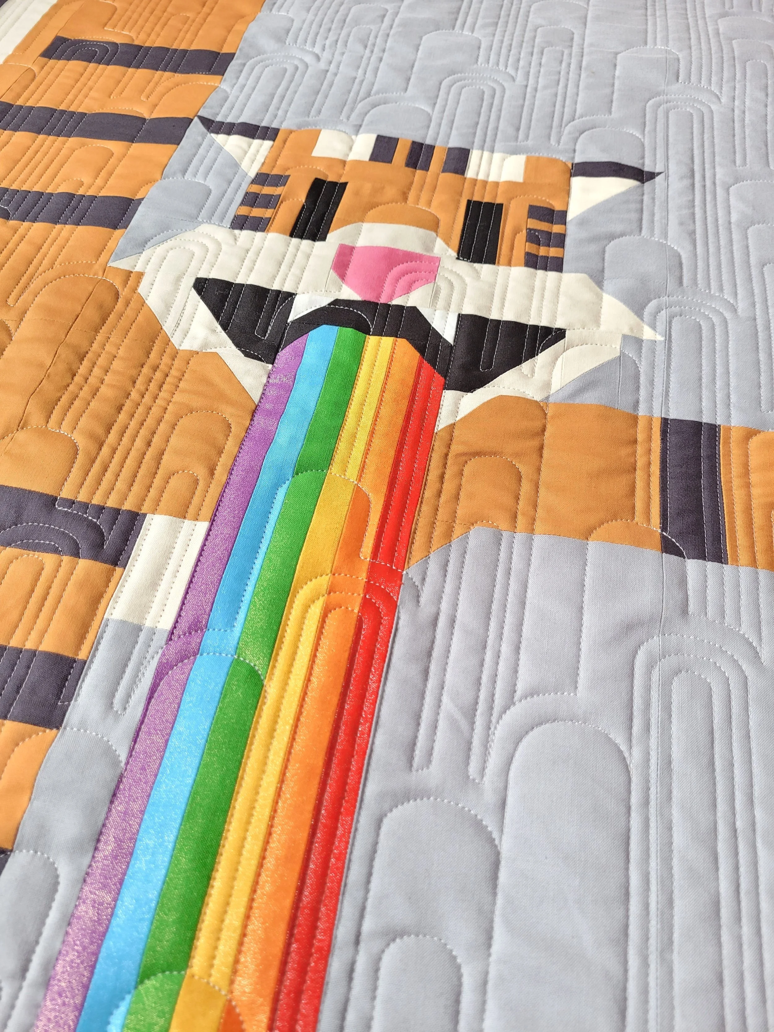
If you stand back from your quilt, you will usually see a natural vertical or horizontal flow to your quilt. Picking a design that compliments that flow looks has a really pleasing effect. It helps your eye know just which way to move around the design. It is pretty clear that Flying Tigers has a lot of up and down movement. He is falling from the sky and puking a rainbow, these actions have pretty literal vertical flow! Deco Arch from the Longarm League shop, highlights the movement, while also giving consideration to the theme of rainbows, in a really inconspicuous manner.
Love Stinks has some pretty clear vertical flow. How about turning Karlee Porter’s Stratocumulus design on its side and making it into some rising stink lines, joining the pieced “love” raising up the the heart?
Sometimes a sampler quilt won’t have a clear directionality, which means you are free to choose how to move the viewers eye around all on your own. When looking at Deep Dive, I pictured bubbles and seaweed rising from the ocean floor when choosing Waves and Pearls by Wasatch Quilting. It also looks great with the horizontal wavy movement of Anita Shakleford’s Modern Curves.

Thread Colour
Now that you’ve picked your quilting design, what about thread colour? Generally a longarmer will automatically pick a thread colour that will blend well over the entire quilt, but sometimes they leave that choice up to you.
This is another one of those personal preference, hot button issues for us whose days are spent wrapped up in the world of machine quilting. I personally believe that an edge to edge quilting design should be there to support the piecing without fighting for your attention in anyway. With that in mind, I pick a thread that blends perfectly into the lightest colour fabric on the quilt. In my experience, a dark thread on light fabric can look like scribbling, and screams for you to look at the quilting design, not the piecing. While that can be used effectively in custom quilting, it’s just not what you’re going for with an edge to edge design. A light thread on dark fabric, on the other hand, is much less obtrusive! I used a silver 60wt Glide thread, called Cool Grey 3, on this Reconnection Quilt.
Picking the right thread is really important with John’s designs, as you want the quilting to liven up the background, especially if you have used a solid fabric, but you don’t want it to take over from the intricately pieced characters. I like to consider, if it is hanging on the wall across the room, do you see a cat in spandex doing Catrobics, or do you see lines across its adorable face?
That’s it! A glimpse into the wheels spinning in my brain each time I face a new quilt top to longarm. I’m sure it all says much more about my personality and quirks than I should be revealing, but please don’t analyze me too deeply! :)
Feel free to contact me for quilting service for any of your projects, or with any questions you might have about the ins and outs of the quilting stage of the process, in general. I am based in Canada, and quilt for both Canadians and Americans.
I offer FREE Quilter’s Dream 80/20 batting for any quilt made with an Art East Quilting Co. pattern!
No codes necessary. If it’s an Art East quilt top, you will automatically receive FREE batting. They make me smile each time I see one in person, and I just want to see them all of the time! They brighten my days.